Product lineup
Two models presented side by side with pricing.
E-commerce
MYFRIX ConceptA product launch page that makes a smart heated mug feel premium, technical and easy to want.
The brief
Concept brief: introduce a new connected product, explain its technology without overwhelming people, present two models and accessories, and capture early demand before launch.
Our approach
What we built
Two models presented side by side with pricing.
Six feature panels explaining temperature control, durability, app control and more.
Eight accessories with prices and short descriptions.
Email reservation form to capture early interest, plus specs and FAQ.
Inside the build
A walk through the key sections of AURA — Smart Mug, and the decisions behind each one.
The page opens on a sunrise camp scene with the product in focus and an oversized AURA wordmark rising out of the image. Before any specs, visitors understand the promise: warmth, wherever you are.
A short, centred statement introduces both models — AURA Steel and AURA Noir — and the three benefits that matter most, before the page moves into the detail. It answers “what is this and who is it for?” in seconds.
Six feature cards pair a category label — Innovation, Durability, Performance — with a single benefit and a dedicated photograph. Complex hardware becomes something people can picture using every day.
Because the product isn't shipping yet, the page converts interest into a first-generation reservation list. A focused dark panel with one email field and one button keeps the action unmistakable.
Technology
Outcome
A complete product launch page with product range, technology, gallery, accessories, specifications, FAQ and reservation flow — designed and built by MYFRIX as a concept project and live today.
Next project
LÀ·BA — Art of Dining
View project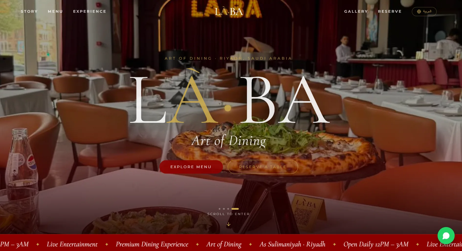
Tell us what you're building. We'll help you turn the idea into a launch-ready digital product.